Recently I was in Los Angeles for a business trip. I used Uber to get me around town and my experience was great. But, while I was there a friend suggested I try out another transportation service called Lyft.
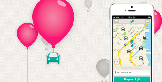
I hadn’t heard about Lyft, but my friend had a coupon code so I decided to give it a go. The premise of Lyft is very similar to that of Uber. When you need a ride, you open the Lyft app and tap a “select a ride” button. Then, you’re given the driver’s estimated time of arrival. When the drive arrives, you hop in and you’re on your way.
In function, Lyft is the same as Uber. But, the user experience of Lyft is very different than Uber. As well, the brands have a very different feeling to them.
Uber prides itself on being “everyone’s private driver” and I feel like like Uber really delivers on that. The first time I used Uber was upon a late arrival to Seattle airport. The driver arrived, I hopped in the back of the black towncar, and I was whisked away to my hotel. There were even some business magazines and bottled water in the back seat to make my ride more pleasant.
Lyft on the other hand is very different. I think the feeling that Lyft is going for is comparable to how you’d feel if a friend came and picked you up. On their website, they have a tagline that says “your friend with a car” and they classify themselves as a ride-sharing application.
Uber on the other hand uses language like “rider” and “driver” which makes it feel a bit more, well luxurious and functional. Honestly, when I hop in an Uber I’m not really looking to have a conversation with a friend, I just want to get to where I’m going in a reliable and professional car (maybe this is the New Yorker in my speaking … being in a car is good “alone” time sometimes).
After trying out both Lyft and Uber, I can see how Lyft caters to a different audience than Uber in that it’s a bit more casual. However, brand experience aside, the user experience of Lyft let me down.
My friend who suggested I try Lyft was with me when I placed the order for a car. After I placed the order she waited with me until the car arrived and told me to keep an eye out for the pink moustache. I had no idea what she meant so I said “what?!” and she said that the car would have a pink moustache on the front. So, I was looking for a car with a pink moustache on the bumper of the car. I mean, where else would you put a moustache on a car?!?!
Well, turns out I was looking in the wrong spot. The moustache is not on the oustide of the car. Nope. Instead, it’s a giant hot pink moustance (that looks more like a massive feather boa) which sits inside the car on the front dash. So, that was my first problem! Also, I don’t recall anywhere within the app experience being told to look for the pink moustache, I only knew that because my friend told me.
My ride finally arrived and I hopped in the back. But it was really cramped (the front seat was pushed way back) and then later I realized a lot of people tend to sit in the front of the car because I guess that’s part of the Lyft culture — to be more friendly and sit in the front.
My driver was nice and we had a pleasant chat. But the payment process was really confusing!
What I love most about Uber is that I never have to get out my credit card and I don’t have to calculate a tip. So, when the end of my Lyft ride was approaching, I imagined that I’d arrive at my hotel and just get out of the car. But, it wasn’t as easy as that.
At the end of my Lyft ride I asked the driver “how do I pay”? He told me to pull up the app and then had to show me (with a bit of struggle) how to pay.
But, here’s where the user experience of paying with the Lyft app is a bit flawed. Unfortunately I didn’t get to take screenshots of my app, so I’ve pulled some screenshots from the Lyft app on iTunes which I’m hoping are up to date!
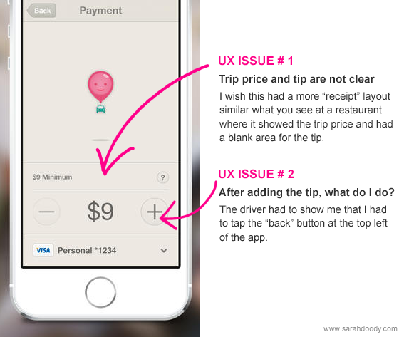
When the ride ended, I had to enter a tip and rate the driver. I can’t remember the order in which I had to do these, but here are my concerns specifically around the payment process:

In the above graphic, I’m trying to show two key problems that I see with the user experience of Lyft, specifically for their payment userflow.
First, Lyft doesn’t add in the tip for you. As a rider, you have to add in the tip yourself and this is friction that I don’t understand. I wish they just added it in for me! But, the layout of the pricing and tip is confusing to me. First, there is the text “$9 minimum” which I have no clue what that means. Does that mean I can be a jerk and leave no tip? Maybe.
Let’s assume I leave a tip by tapping the plus sign (and minus sign if I change my mind). What’s confusing is that it adds the tip to the ride price. So visually, I never see the trip price and tip separately. I wish it were more like a restaurant bill where I see the price of the trip, the amount of tip I’m adding, and the total price. Not sure why Lyft decided to combine this into one number.
Also, once I add the tip, I had no clue what to tap next. I had to ask the driver what to do. After looking at the app for a few seconds he realized I had to tap the back button. Again, not very intuitive. For a major action of “ok, I just added the tip and I just want to get out of the car” I’m not sure why Lyft decided to rely just on the teeny tiny little “back” button.
As I said, I had a good ride and my Lyft driver was nice. But I felt like there was too much extra friction in the payment process for me. I don’t want to have to make a decision of how much to tip. I just want to get out of the car as soon as I arrive at my destination.
As for my future rides, at this point I think I’ll remain an Uber girl. But, I’m curious to see what happens with Lyft and if they are able to develop a great audience and business by differentiating on the brand experience and not necessarily on function.
PS: Also, I live in NYC and I’m pretty sure Lyft isn’t available in NYC!