
I’ll admit it, I’ve reluctantly grown to appreciate and use Google Drive. I now like Google Drive because it makes collaboration between documents easier. I’m often sharing documents with people, and with Google Drive, it’s really easy to share documents.
Also, I love that in Google Docs I can comment and reply back to comments within a document. This helps make collaboration easier and get feedback out of emails … you know you’ve been on those email threads that start with “see my changes in purple. It’s so frustrating!
Earlier this summer, Google launched a new user interface for Google Drive. According to Google’s blog post about the new interface, the goal was to make it easier to use:
It’s also easier to take some of the most common actions — simply click once on a file to see recent activity, share with friends, or enable offline access. For you organizational fiends, you now have three easy ways to take group actions on multiple files: right click on the selected files, use the menu above the file area, or simply drag the group to a new location in Drive
I was excited to try out the new Google Drive because there are many little details within the UX of Google Drive that drive me crazy and aren’t very intuitive. I know this example isn’t related specifically to Google Drive, but here’s a post I wrote about a UX issue in Gmail.
One day, I was in the new Google Drive interface looking for a document that was shared with me. Naturally, I was looking for a link that said “Shared” so that I could see all documents that were shared with me.
I looked, and looked, and looked …. and I couldn’t find it. Then, I noticed a link called “Incoming”. So I clicked it, and realized that’s where my “Shared” documents were in the new Google Drive. Here’s a side by side comparison of the old and new Google Drive navigation bars.

Was this a major change? No. Did it have a negative affect on my user experience? Yes. Why? Because I had to work to figure out where my “Shared” documents went. It slowed me down. And I couldn’t quickly find the shared document I was looking for!
The naming inconsistency in the new Google Drive is a great example of why every detail matters in crafting a great UX.
Here’s why every teeny tiny little detail really does matter.
Once you have a large user base who is familiar with key interactions on your website, every change you make has huge implications for the experience of your users.
If your users are interacting with your product every day (which is likely the case with Google Drive users) they’ll begin to know your product so well that they almost don’t have to think about using it anymore.
As a result, when you make a subtle change such as the wording of “Shared” to “Incoming” it can easily throw your users off and cause a lot of frustration and confusion.
Yes, this is a little change and yes I did eventually realize that “Incoming” in the new Google Drive meant “Shared”. But my point is, why change it? Why throw a little round-a-bout in the experience of your users?
In my opinion, the wording “Shared” is much more intuitive than “Incoming”. When I compose a document and decide I want to share it with someone, I’ll still choose to “Share” it. I won’t choose to “Outgoing” it. The word “Shared” is just so much more logical because the action I take is to “Share” the document!!
Ok, I’ll stop by UX rant! But hopefully you see the point!
Haven’t used the new Google Drive yet? Check to see if you have access yet
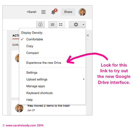
To try it out, login to your Google Drive account, click the settings (or gear icon) at top right of the screen, and then look for the “Experience the new Drive” link in the dropdown menu:
What do you think?
Have you used the new Google Drive? What do you think of it? Are there any things that you’ve found either confusing or things that are now easier? I’d love to hear your thoughts and ideas in the comments below!